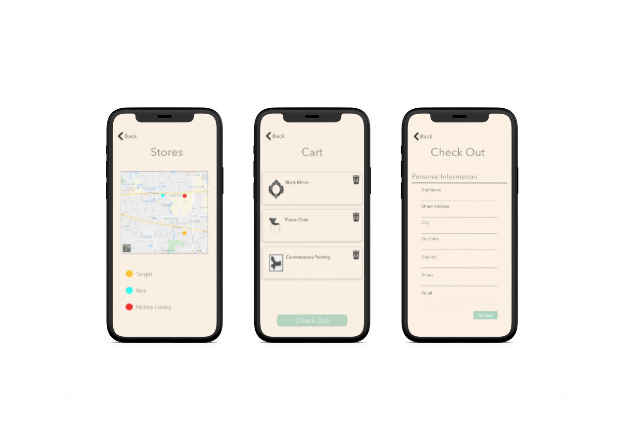
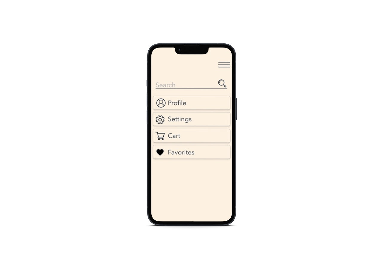
In my first UX class, I designed an app that would make the interior designing process simple for anyone. The goal of this app was to make the shopping experience easier for everyday shoppers. It combined multiple stores into one app. I did user surveys to find what users looked for in their shopping or home design experience. With this information, I created features that would benefit them. I tested the prototypes in sketch and got great feedback about the flow of the app.
My Process
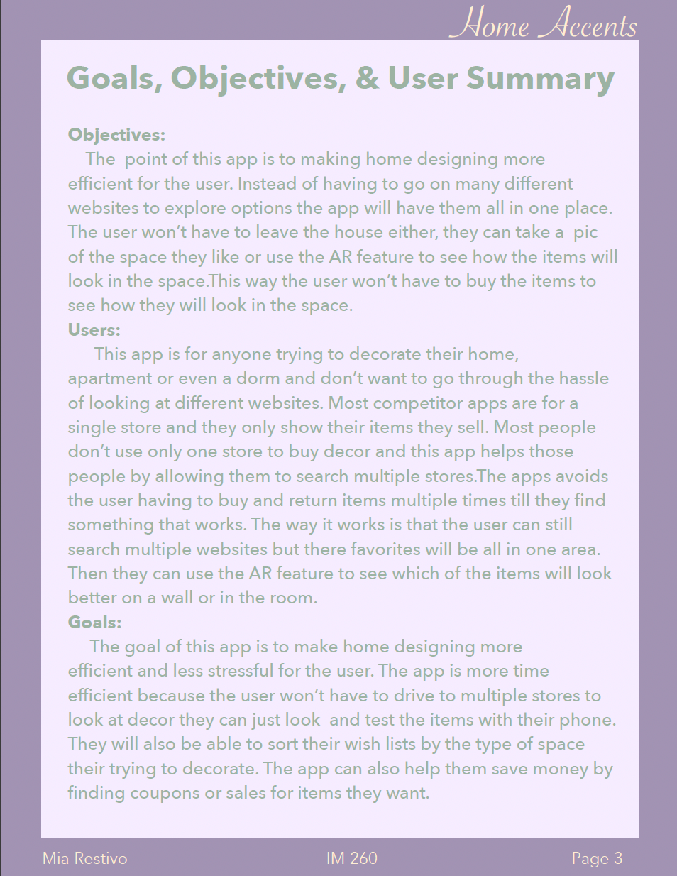
In this image is a list of objectives, users, and goals for the app I designed.
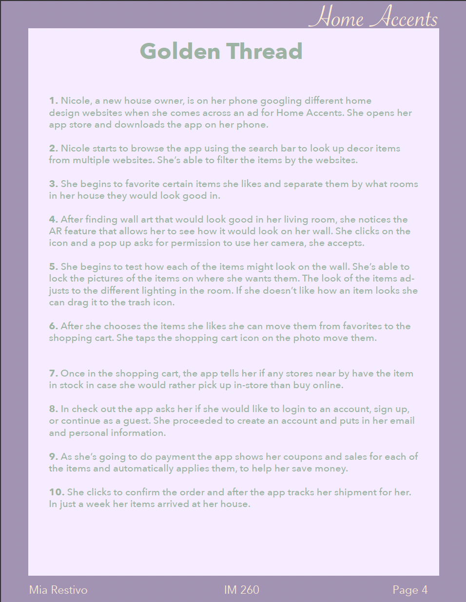
A golden thread is a storyline of how a user might use the app and the process they go through.
Empathy Map and MoodBoard
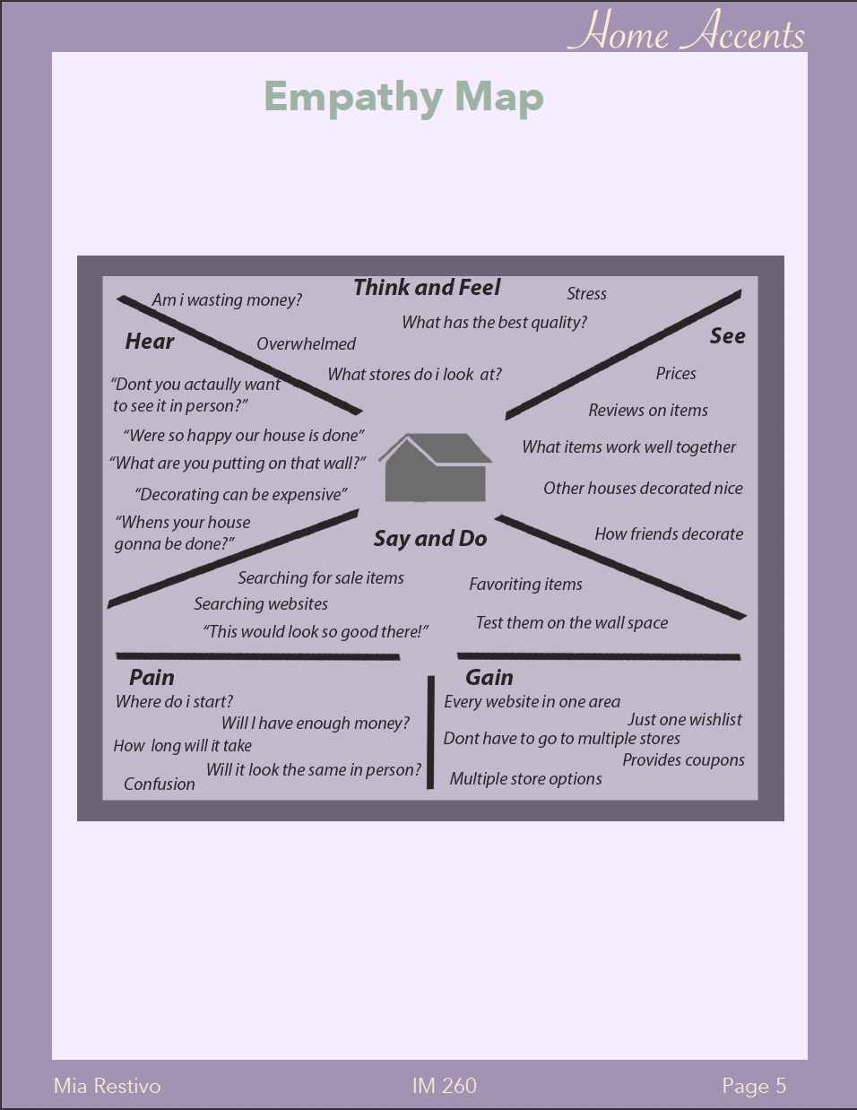
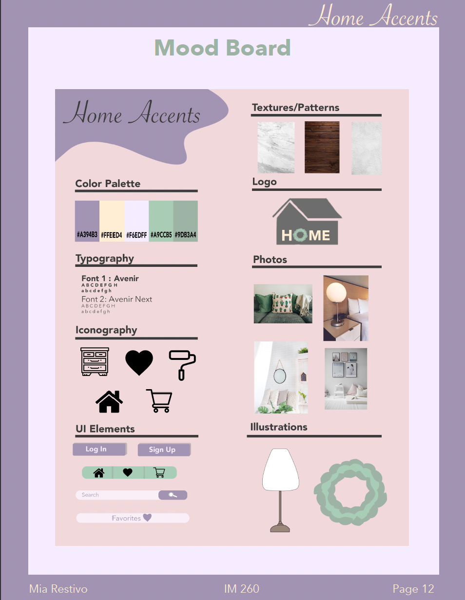
The purpose of an empathy map is to try and understand the feelings a user might be experiencing. The mood board shows the first visual ideations I had for the app.
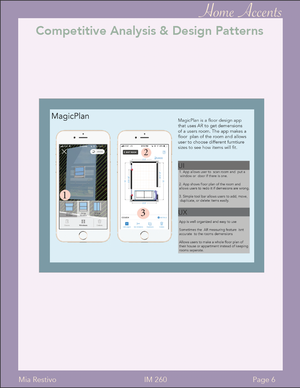
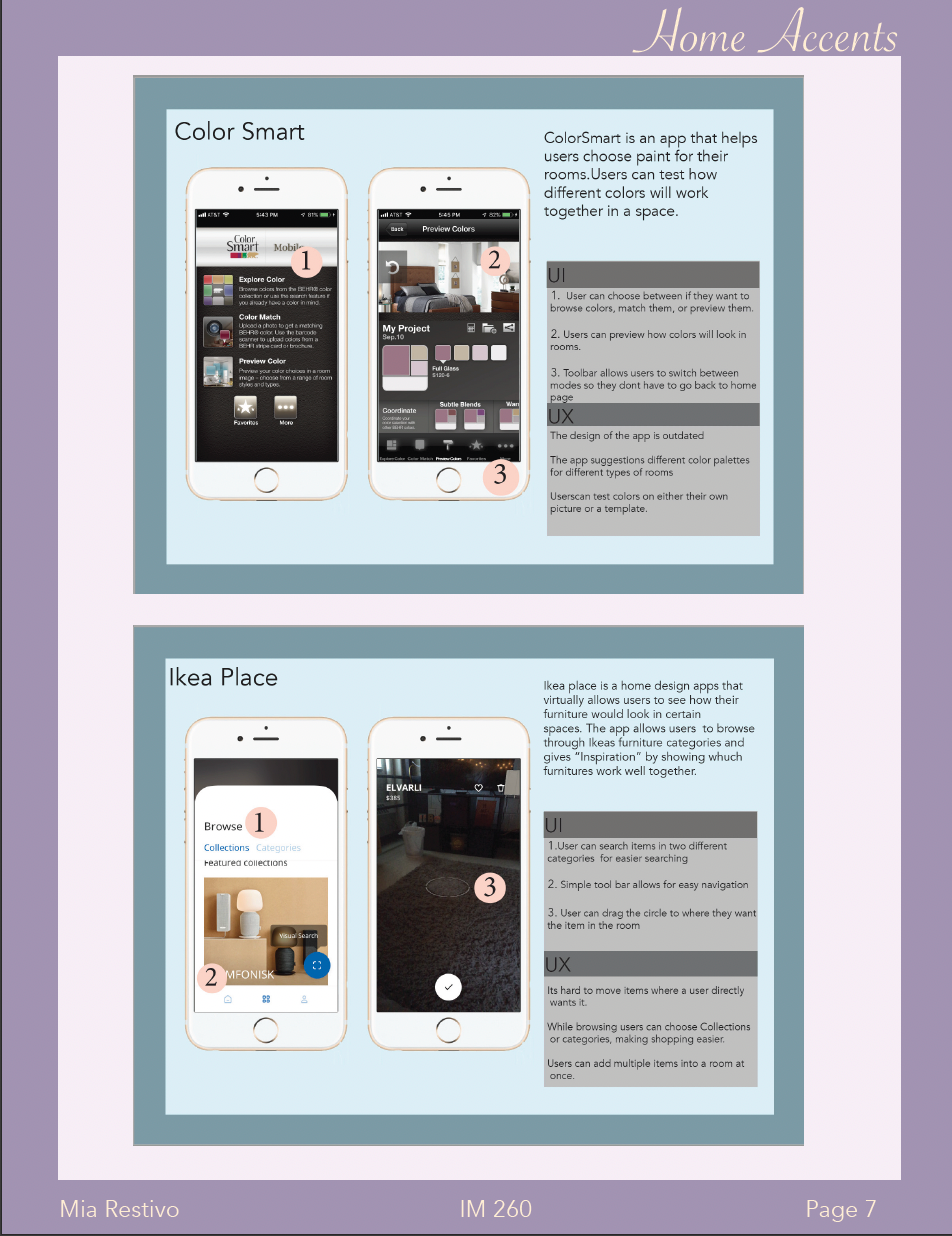
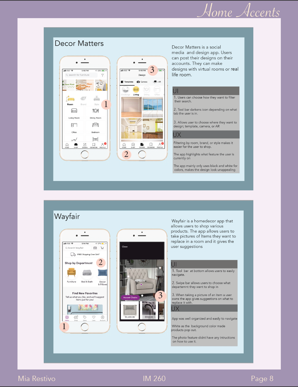
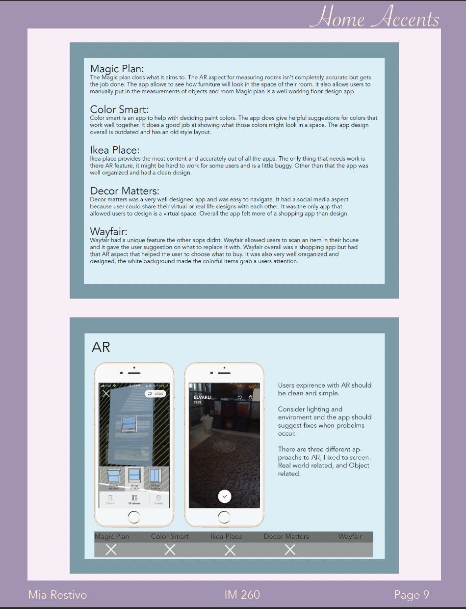
For these next images I analyzed what features these apps shared and which ones they had or didn't have.
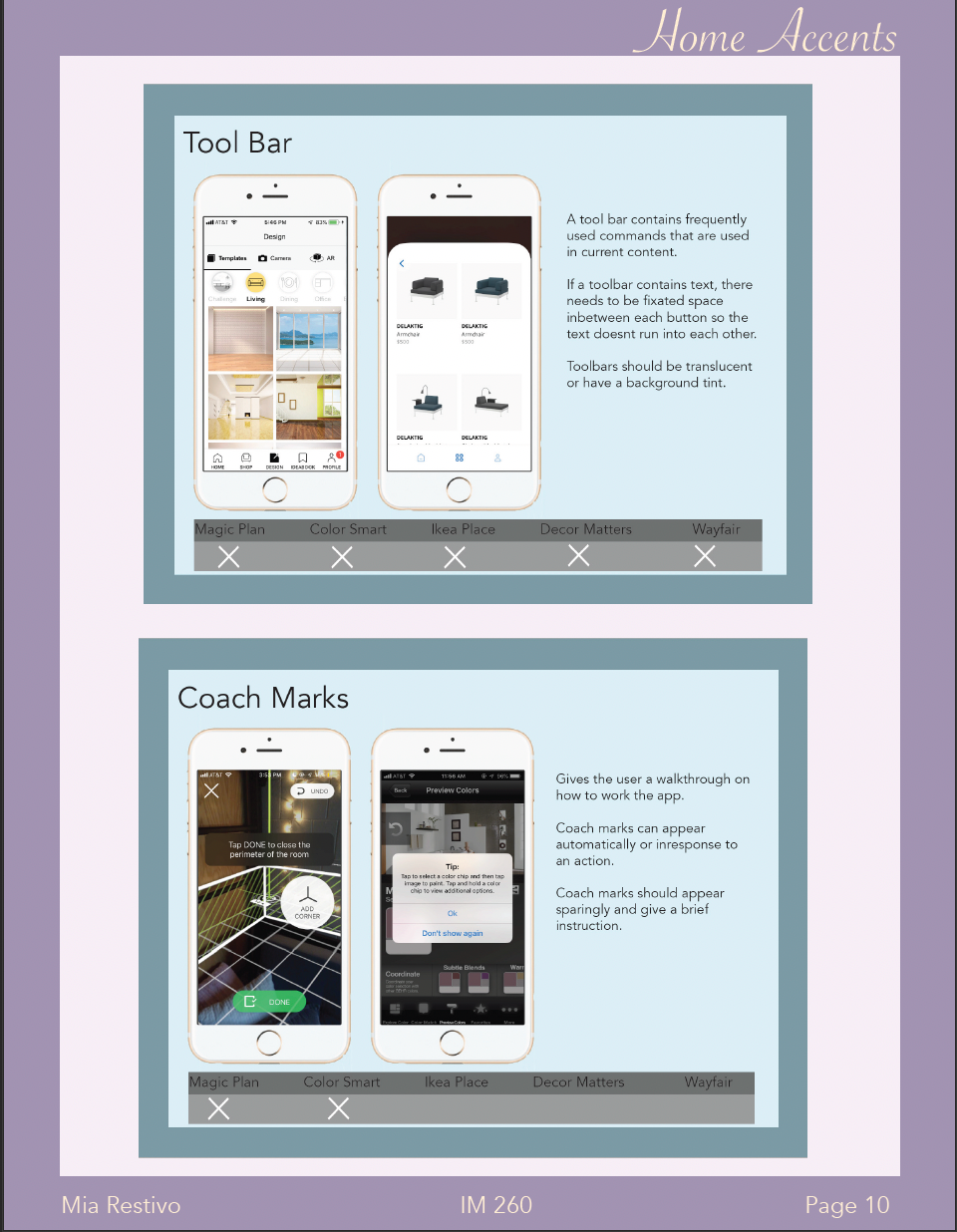
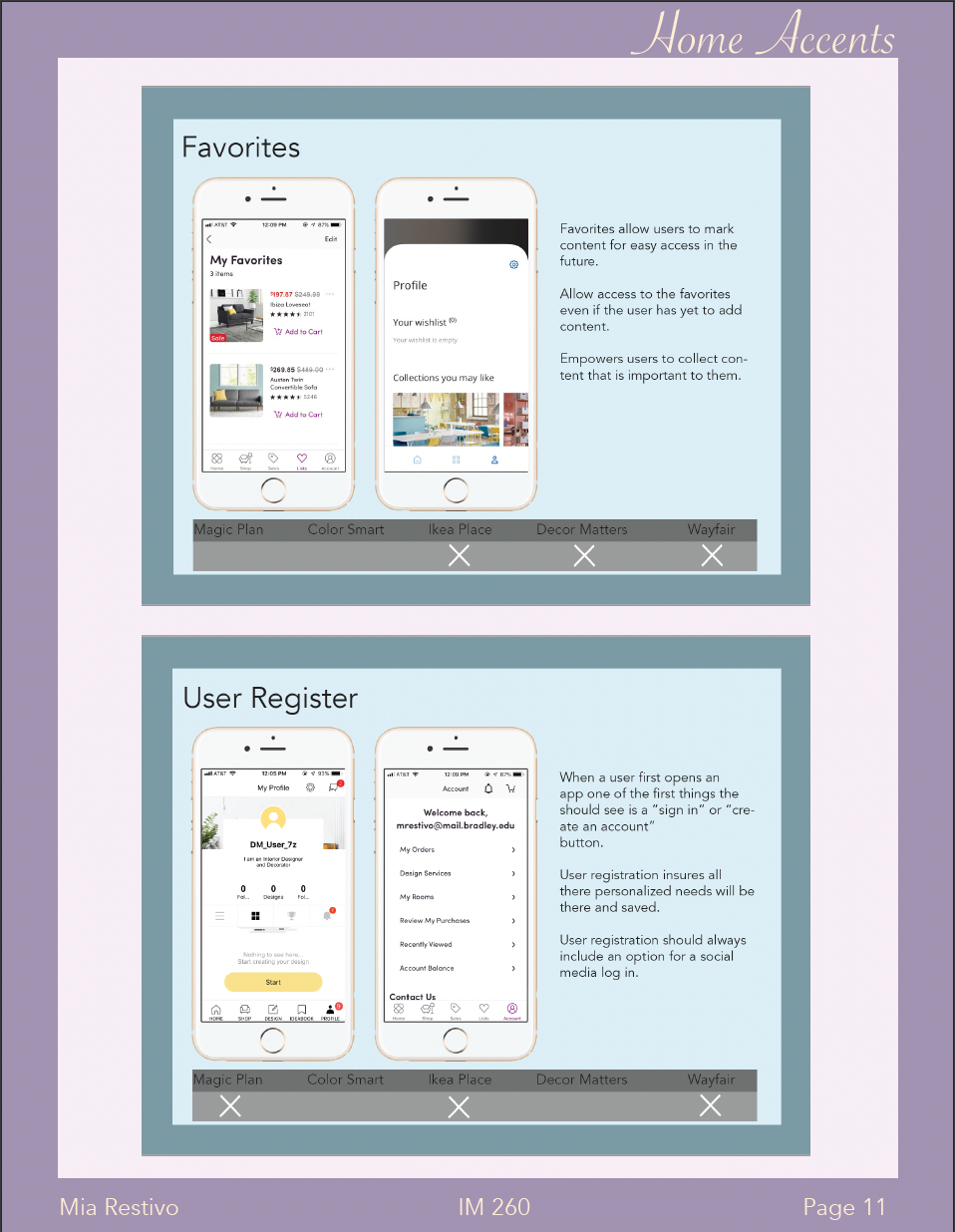
Competitive Analysis
I picked five similar apps to the one I was designing and analyzed what worked with them, what didn't, and what features they shared.
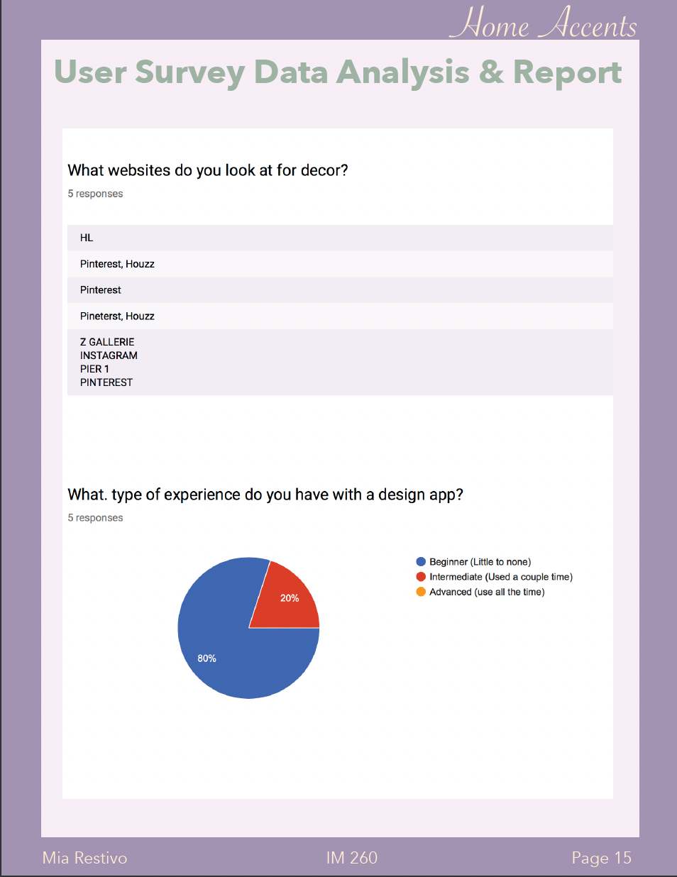
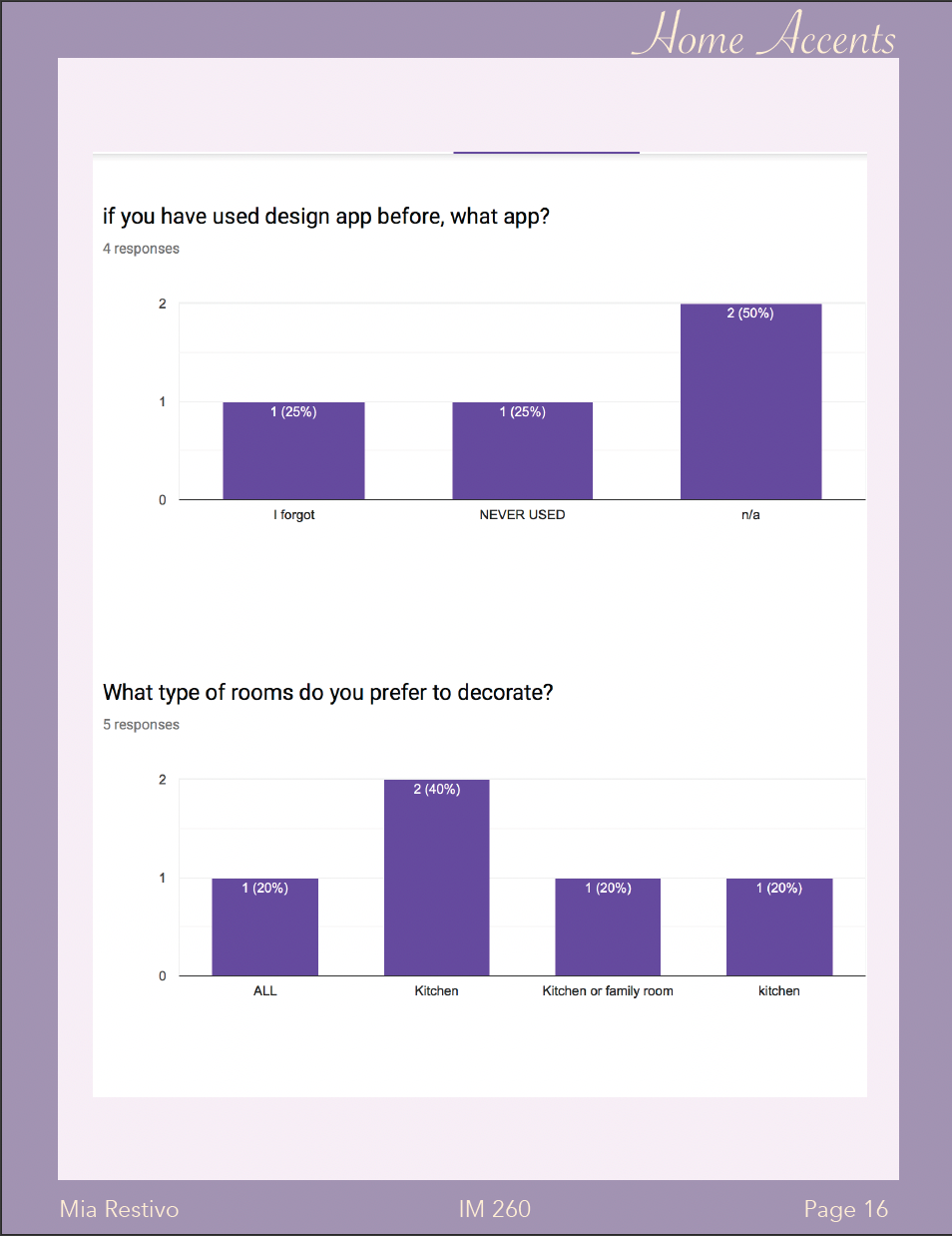
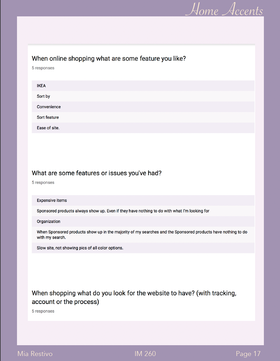
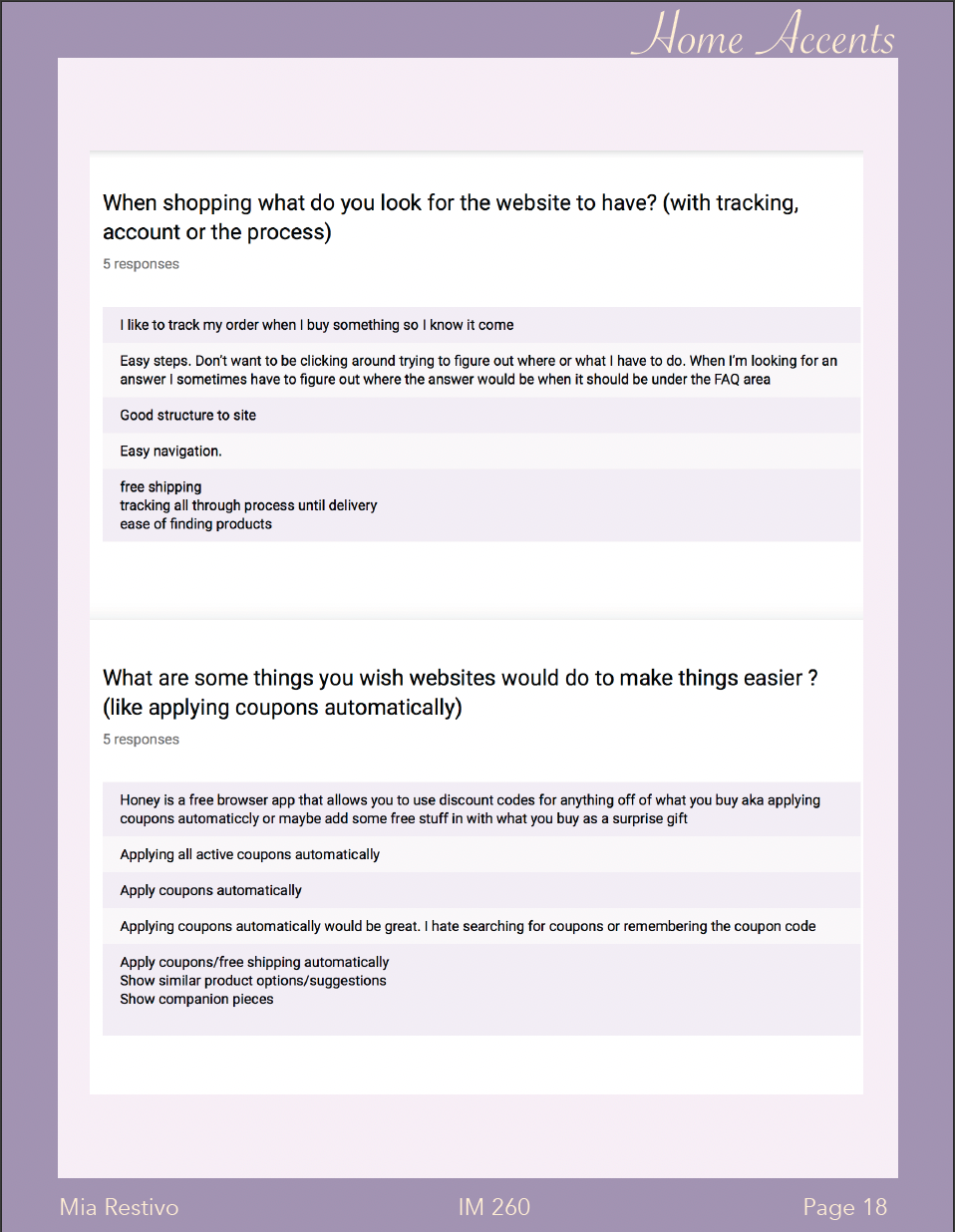
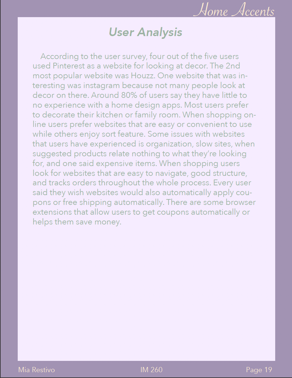
Survey Results and Analysis
I asked five potential users some questions to understand what they would want to gain from an app like this.
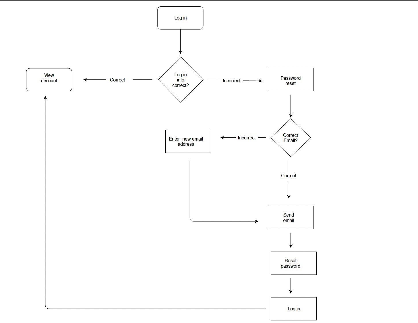
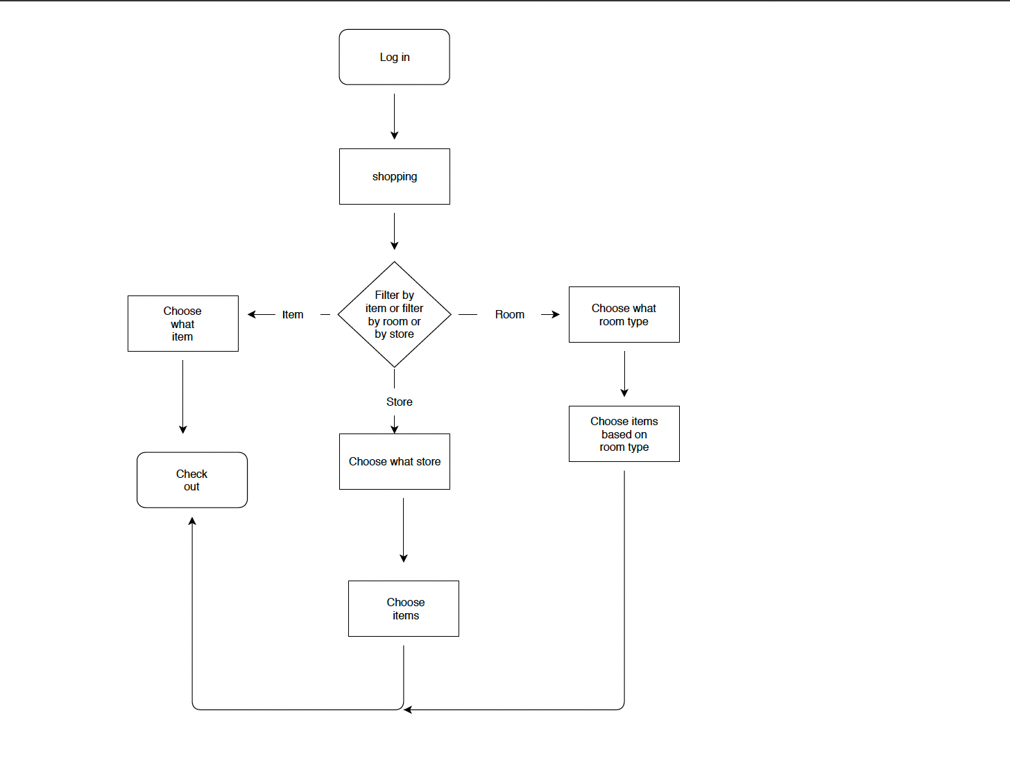
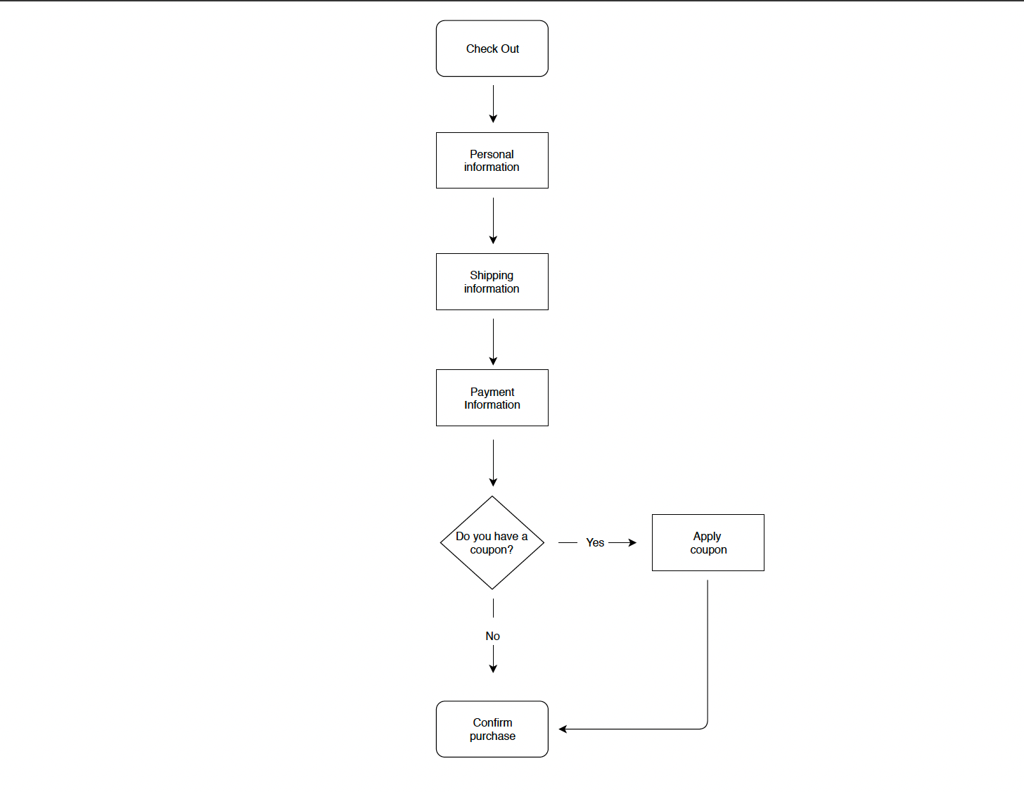
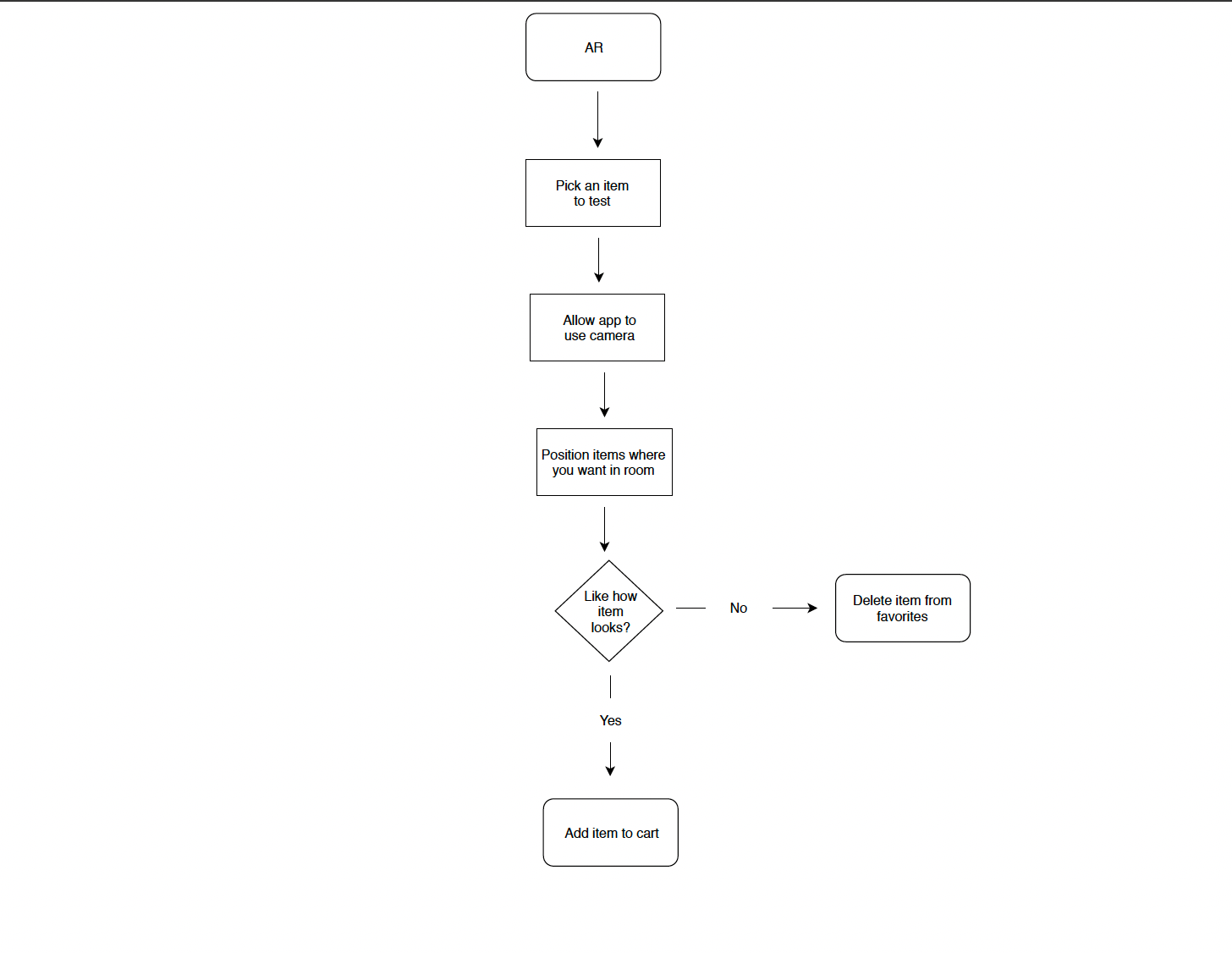
User Flows
User flows show typical paths users would take while using the app, I created four potential scenarios a user could experience.
User Test Tasks and Results
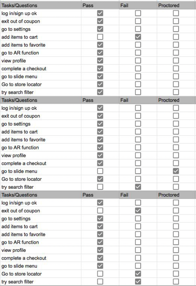
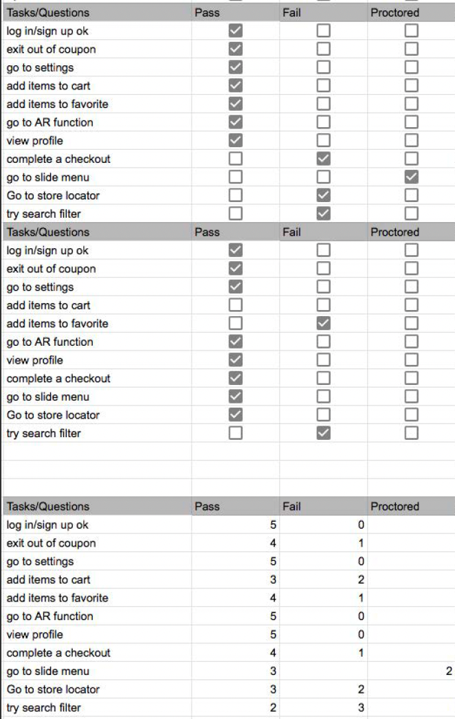
I had five people test out the prototype and gave them different tasks to accomplish. The images show whether they passed, failed, or proctored. This helps to show if the app is easy to navigate or if changes need to be made.
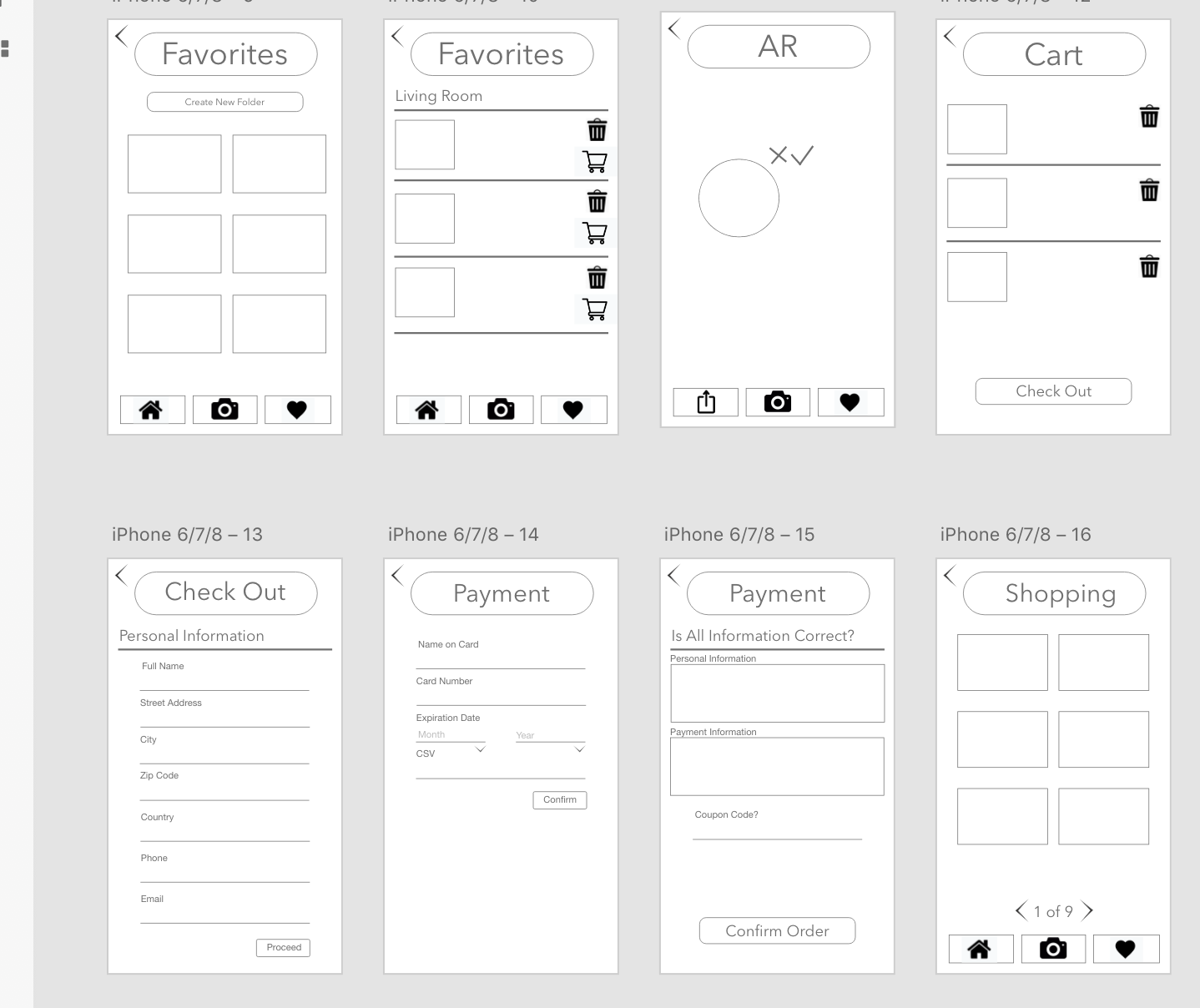
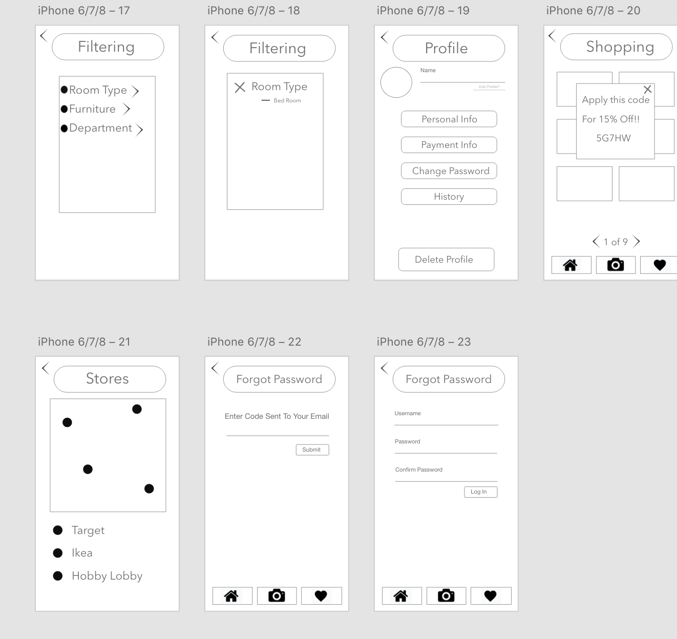
First Mockups
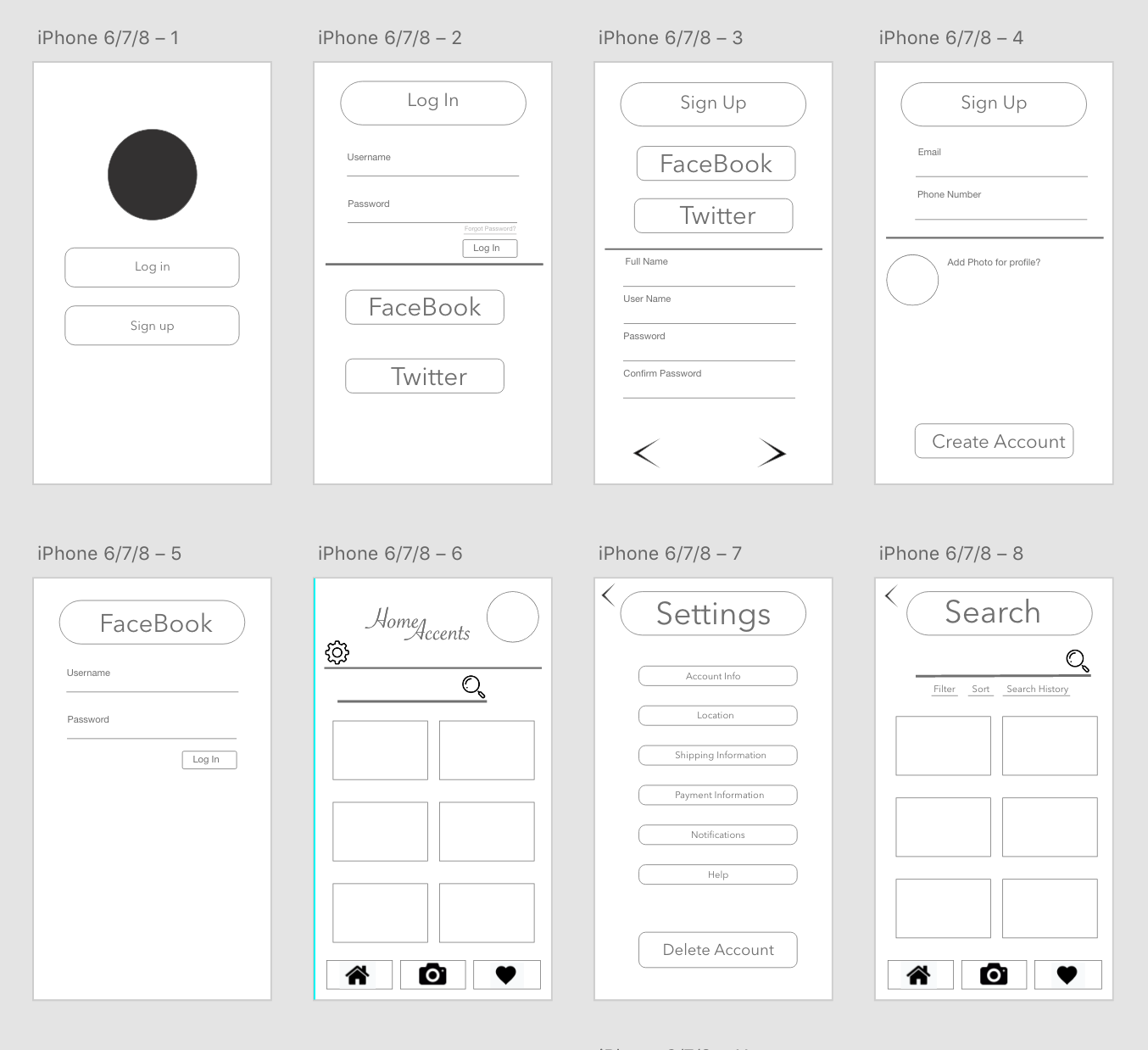
These are low fidelity screens, low fidelity is very simple screens with little design and no color.
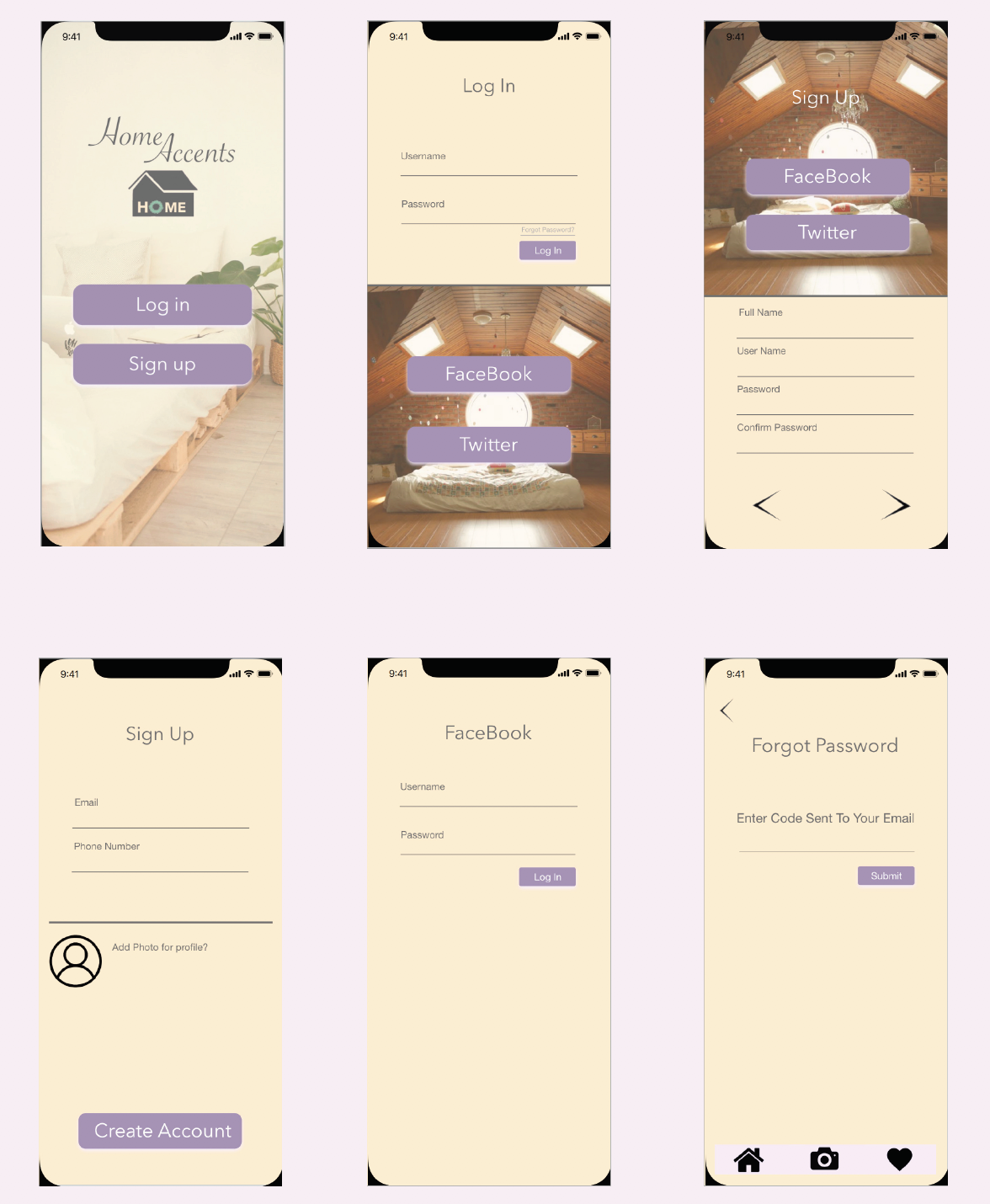
Original Design
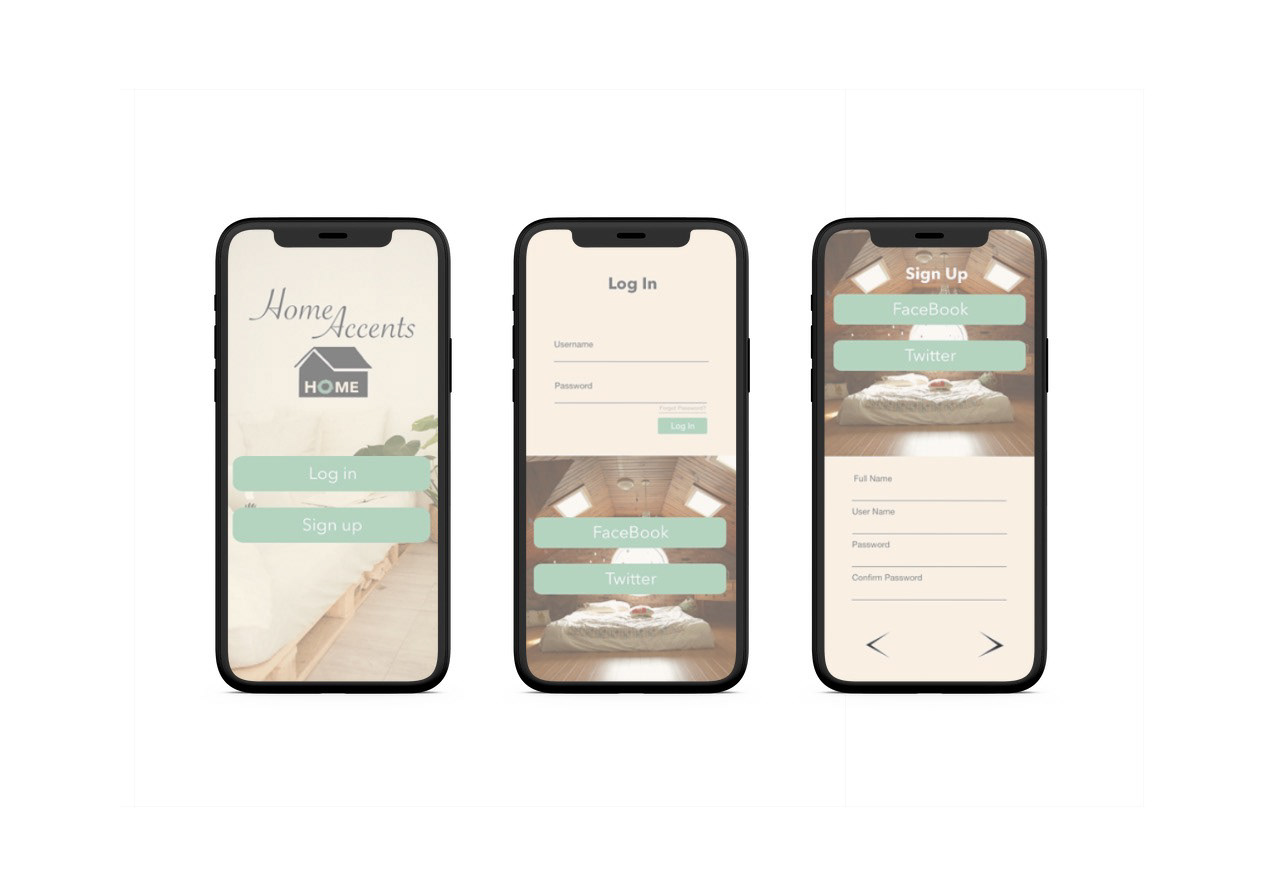
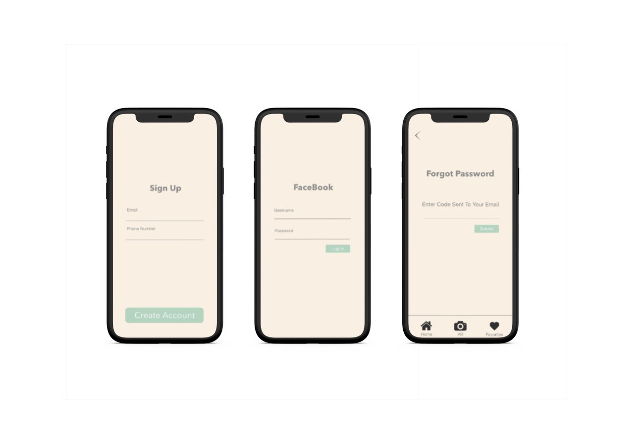
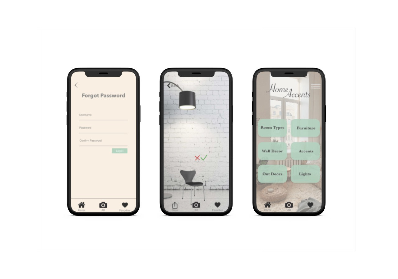
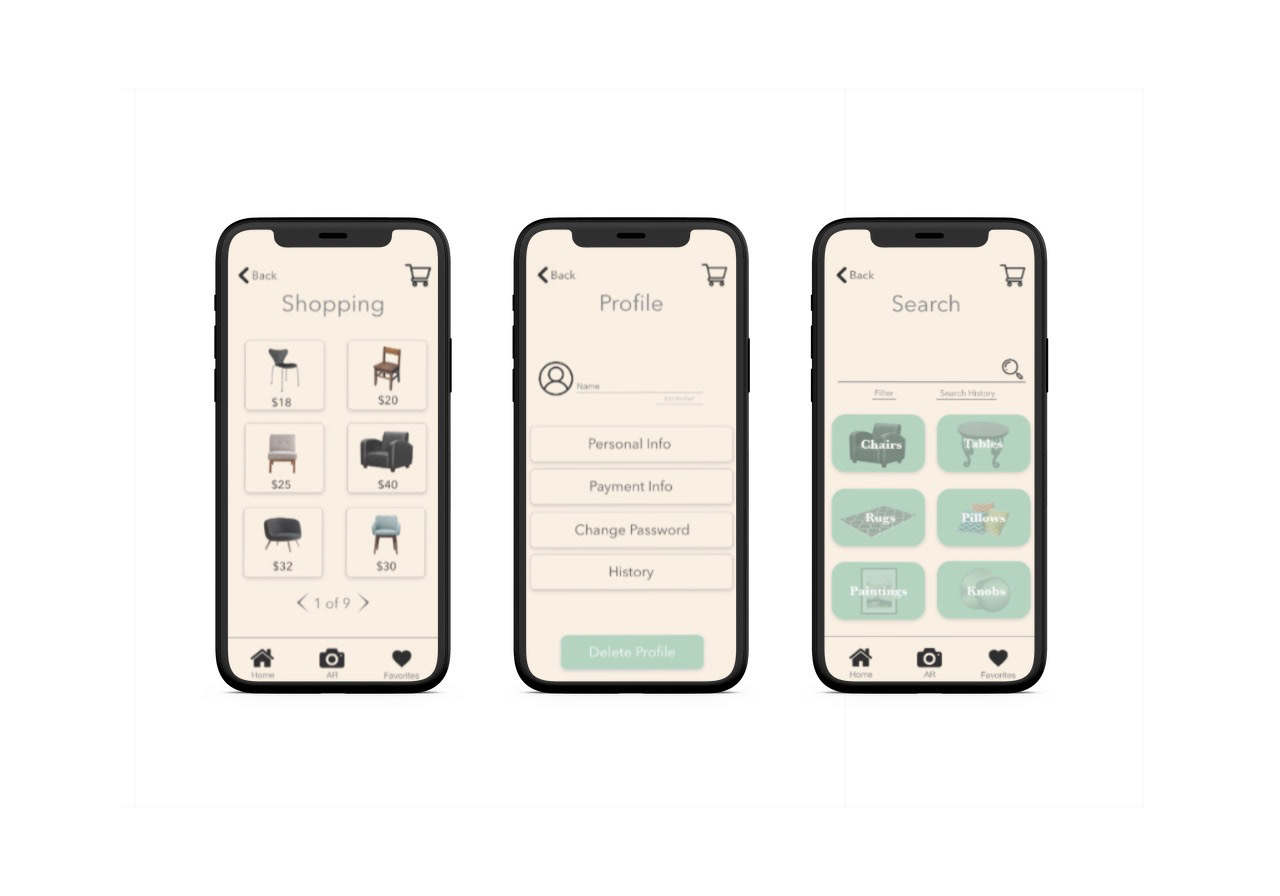
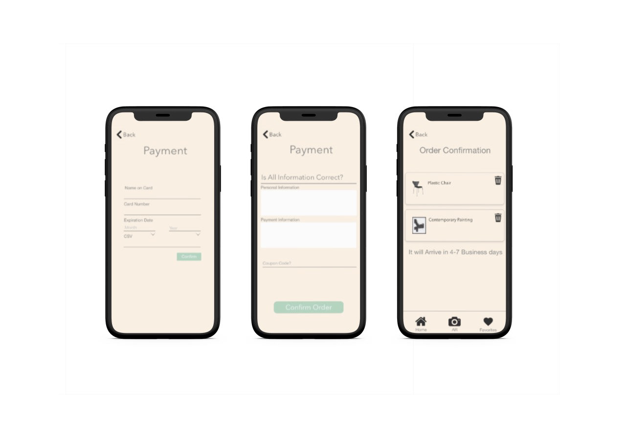
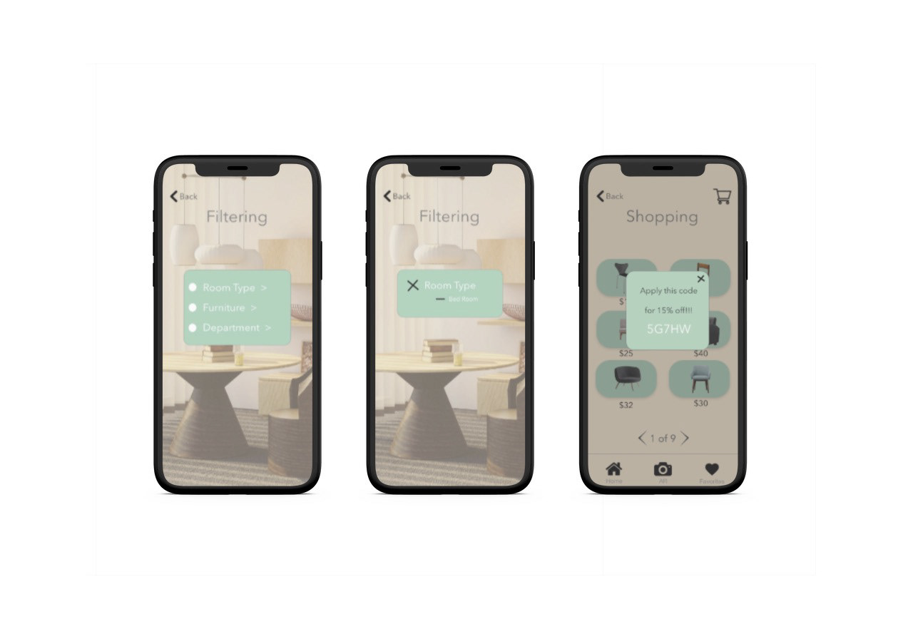
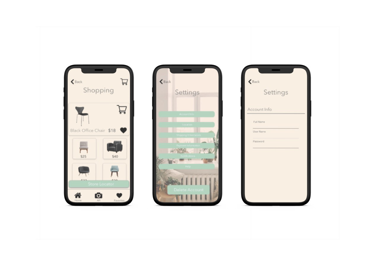
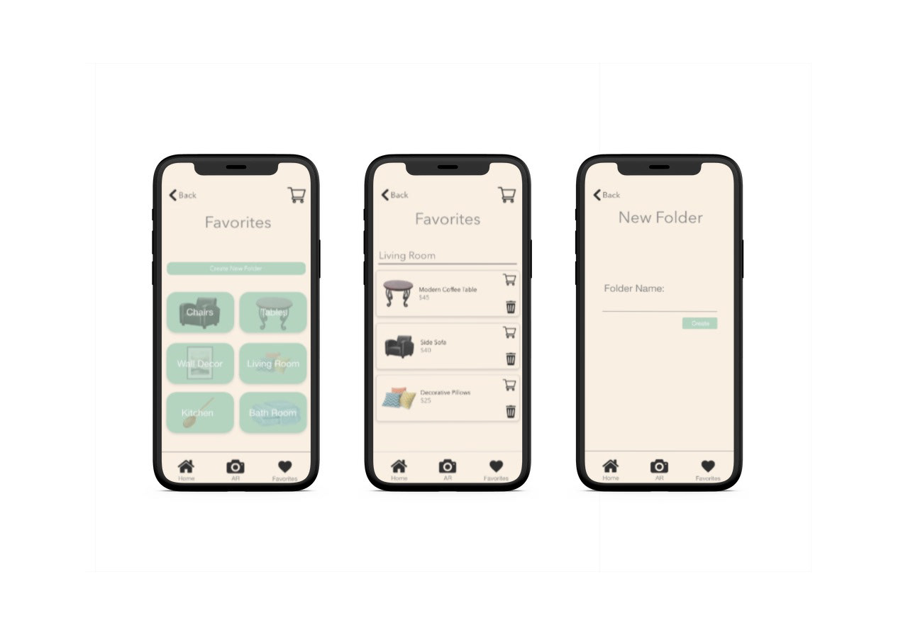
These are the screens I originally designed in my first Ux class in 2019.
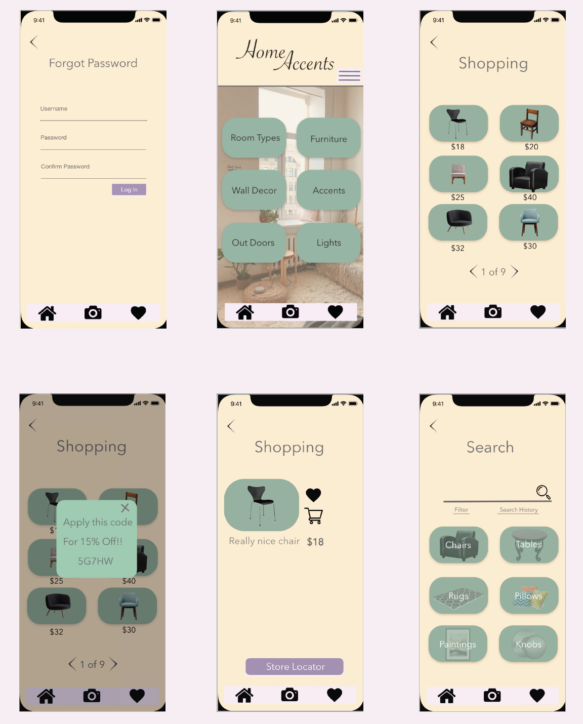
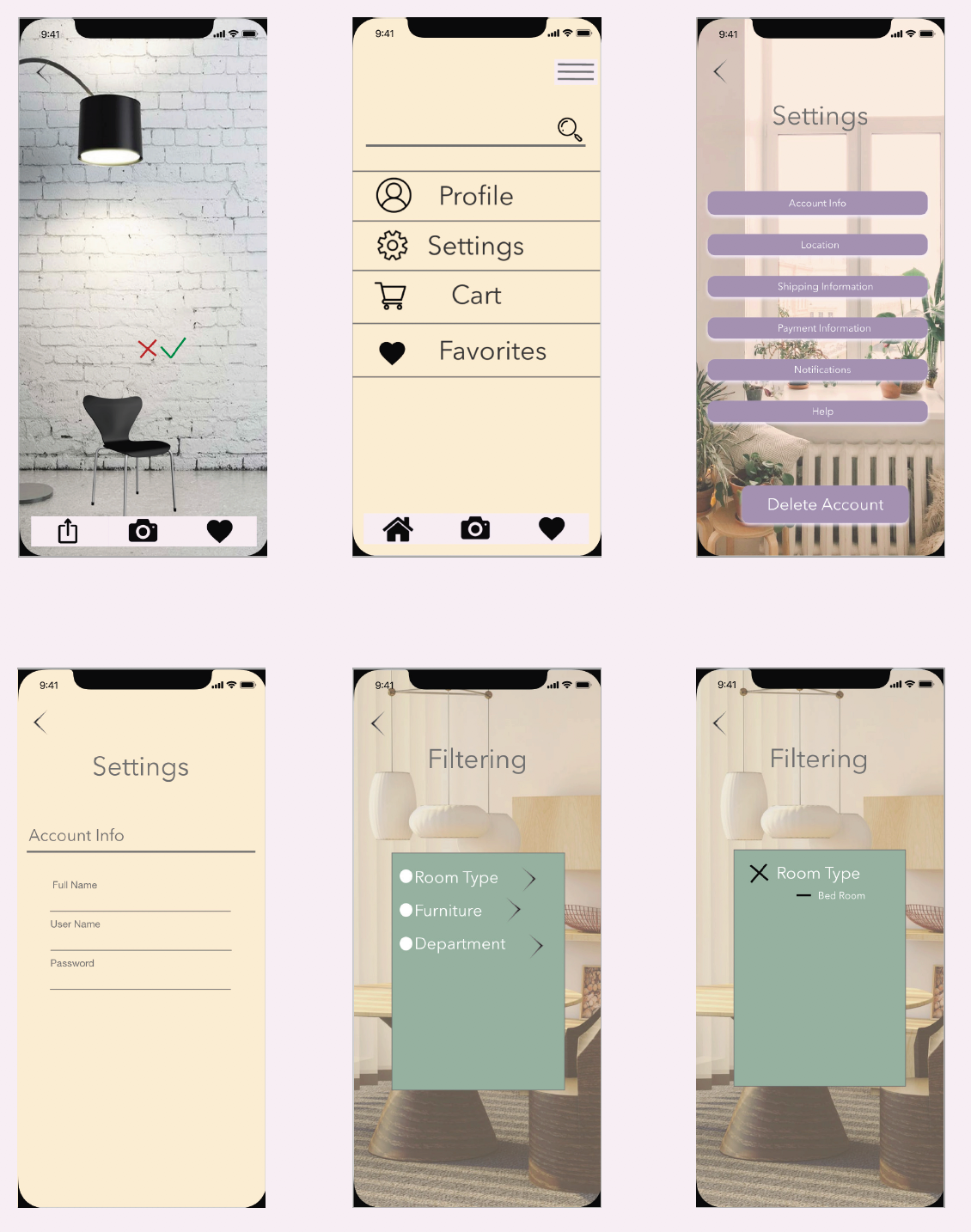
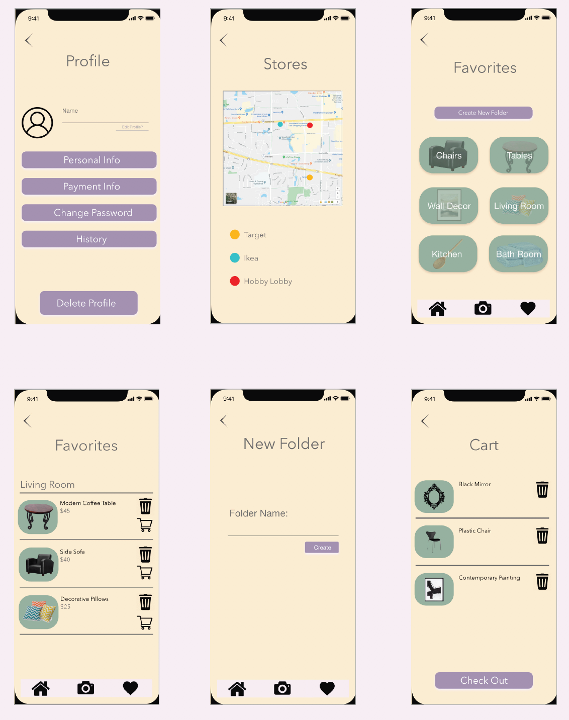
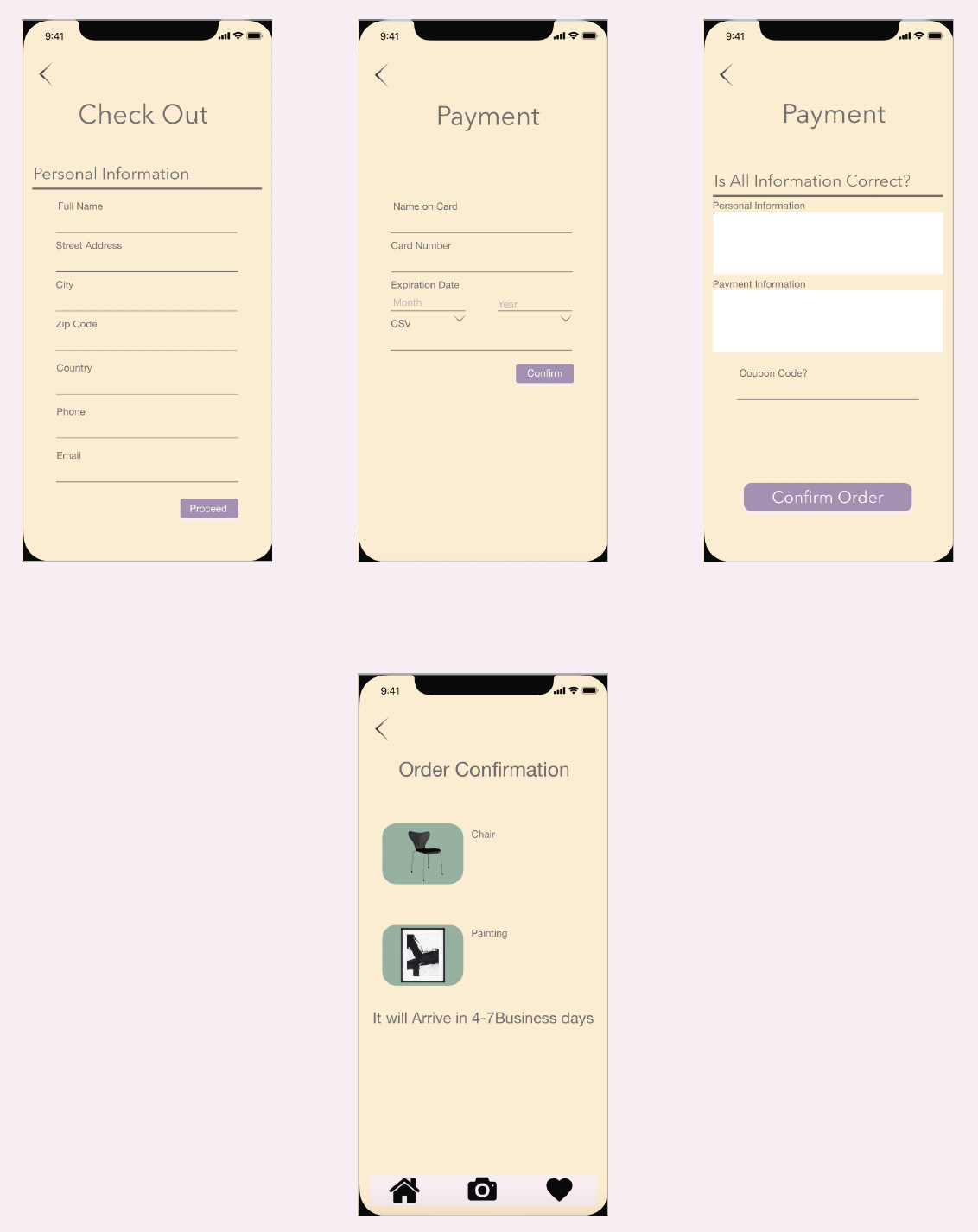
New Screens after redesigning them
At the end of 2021 I went back and updated the designed based on what I know now, while still keeping the original layout of the app.
